Exploring the Visual Evolution: A Case Study on the Redesign of the Vinted App Interface
Company: Vinted
My role: UX-UI Designer
Deliverables: Onboarding, Home, Navigation Bar, Prototype
Scope: 1 week
*A Project carried out within the framework of the UX-UI Design Ironhack Bootcamp

Overview
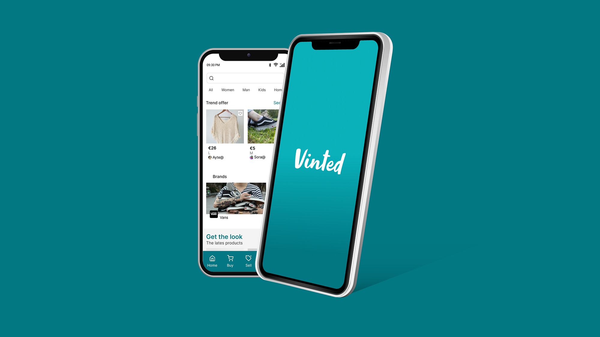
Vinted is a mobile browsing application that offers second-hand clothing to buy or sell.
Challenge
My mission in this project is to improve the user experience by redesigning some basic functions of the application based on usability tests and heuristic analysis.
UX Research
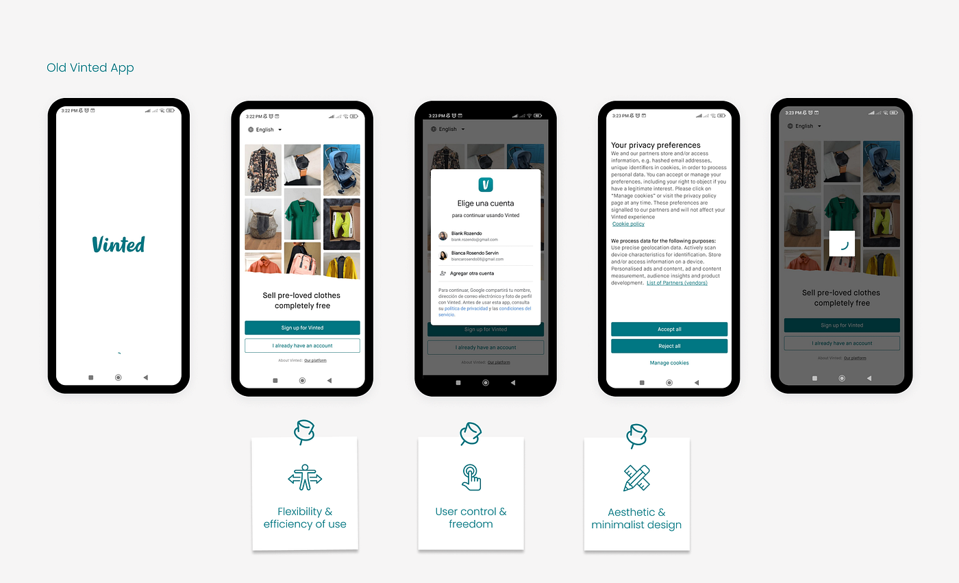
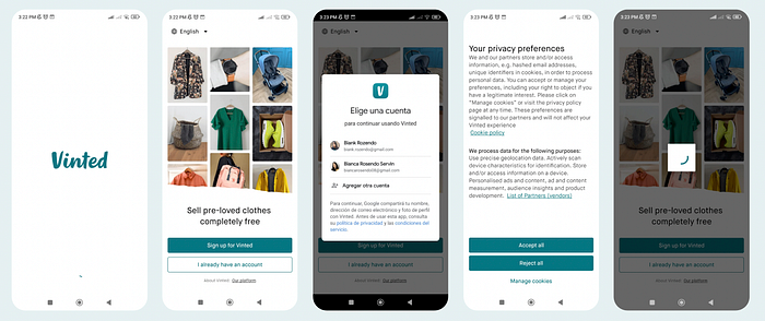
After conducting a heuristic analysis, I have identified certain areas where improvements can be made:
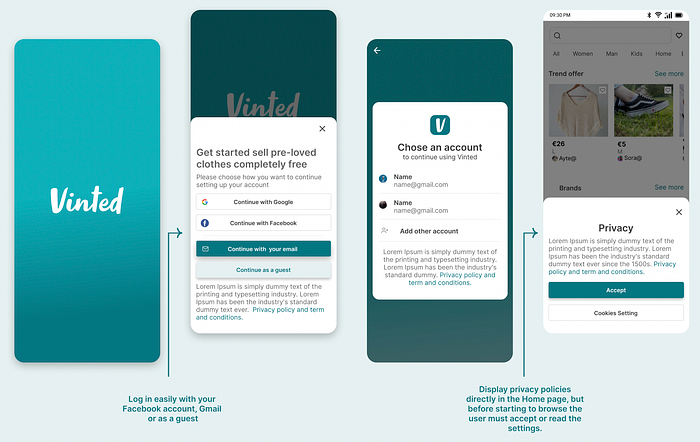
- Flexibility and efficiency of use: Reduce the time by setting up an account with Gmail or Facebook and add the option to log in as a guest, later if the user really wants to use the application he will end the subscription
- User control and freedom: Display privacy policies directly on the home page and not in the onboarding, however, before starting to browse the user must accept or read the settings.
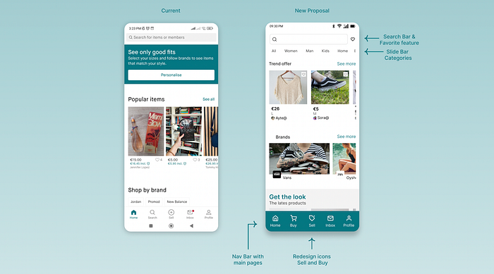
- Aesthetic and minimalist design: Redesign the home page with a new organization of product categories, add a list of favorite products, and a new menu bar with the main pages, including the shopping cart.
Problem Statement
New Vinted users need to log in to the app faster and easier with their Google/Facebook account, or even as a guest because they need to discover content and then start their subscription
to sell or buy items.
Brand Guidelines / UI Elements
To refresh Vinted’s brand identity, I incorporated the following elements:
- Inspired by green, it is known for its association with optimism and growth.
- Selected a palette of complementary shades to establish a cohesive visual language.
- In addition, I chose a sans-serif typeface renowned for its legibility and ability to convey a contemporary, modern aesthetic.

Wireframes
At the outset of the design process, wireframes are employed to lay the foundation for a page’s structure, serving as a crucial step before delving into the visual design.


Prototype
After doing the necessary sketches in the ideation phase, it’s time to start the high-fidelity prototype. I respect the brand guidelines and redesign some aspects that create a better experience for the user. Also, my suggestion involves creating a more attractive and current app design.
Keep your focus on these key elements
Main features to transform the user experience:
- On Quick and Easy Boarding, reduce the time setting up an account with Gmail or Facebook and add the option to log in as a guest.
- Home page, which now features a slider bar showing the main categories. Additionally, I added a “Favorites” section at the top, reorganized the product layout, and introduced a navigation bar with quick access to essential pages, including new icons for “Sell” and “Buy.”
Discover how it works here! 👇
➡️ Also you can see the prototype in Figma
Testing and Next Steps
The proposed solutions have worked to provide a better experience in the application. The next steps are to continue testing and continue designing the purchase process to test the product with real users.
Thank you so much for reading. 😬
If you find this article interesting or useful, please consider giving it a clap.